
“But times do change. Balmain is now a fast-growing brand relying on new media to communicate to a global audience. To best meet the challenges and opportunities of today, we unveil a newly updated logo for Balmain Paris,” he continued.
The new design, or the “B” as Rousteing’s team calls it, echoes some of Pierre Balmain’s mid-century monogram designs. Look closely and the letter “P” – in homage to the brand founder and Paris, the city inextricably linked to the company – is visible in the bold typeface.
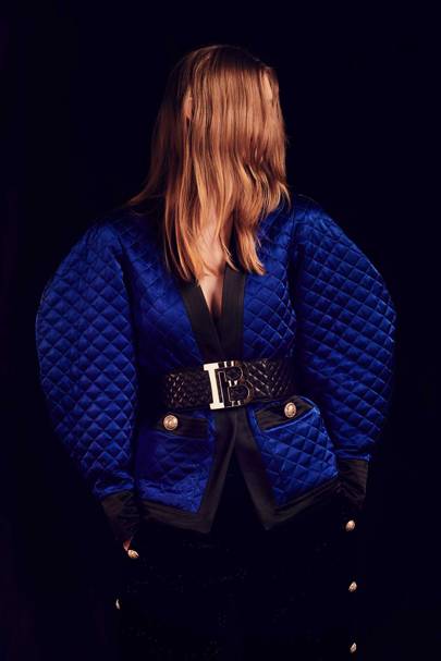
Created in partnership with Paris-based creative studio Adulte Adulte over the past year, the logo will first appear on a new bag style aptly dubbed the B bag, and then on the graphic T-shirts and bold buckles in the pre-fall 2019 collection.
“I am quite pleased with what we’ve created: a contemporary, clean and bold logo for this historic house, which manages to retain the heritage of the original, while making clear to all that it represents a French luxury brand for the modern era,” Rousteing added. “My team and I look forward to exploring new ways to incorporate it into future designs.”
The redesign follows the news that Balmain is returning to the couture calendar for the first time in 16 years. Both business moves can be seen as a sign of Rousteing’s efforts to expand Balmain’s world and his ideology as its leader.
No comments:
Post a Comment