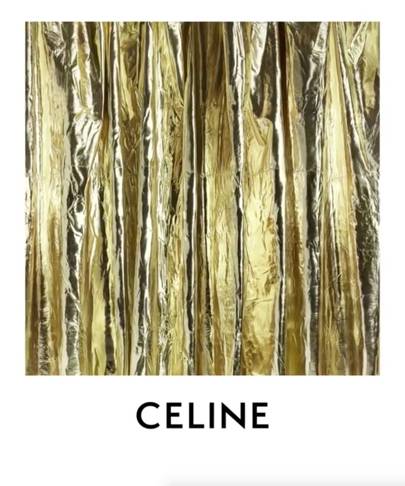
“The new logo has been directly inspired by the original, historical version that existed in the 1960s,” Céline revealed on its Instagram account, in a caption to a video post of a slow pan across a softly fluttering gold lame curtain. All previous posts on the feed, dating from the Phoebe Philo era, have been deleted.
“The modernist typography used dates from the 1930s,” the statement continued. “The accent on the “E” has been removed to enable a simplified and more balanced proportion, evoking the Celine collections of the 1960s where the accent wasn’t used often.”
“The spacing between the letters has been balanced out and the letters have been brought closer together. The 1960s version of the logo including the word “Paris”, will be reinstated within the clothing and on packaging, however “Paris” will not appear beneath the logo on campaigns.”
Slimane, as we know, has a smoothing touch. As creative director of Saint Laurent, he caused controversy when, in 2012, he dropped the “Yves” from Yves Saint Laurent and killed the mythical 1961 logo by French-Ukranian painter Adolphe Mouron Cassandre, replacing it with a less romantic Helvetica typeface.
A keen typography enthusiast, Slimane told Wallpaper* at the time that he was paying close attention to visual communication, an aspect of the fashion industry that was once neglected but has now became as, if not more, important than the product itself: “Concentrating on the base before approaching the form. The fundamentals, the signs, the language, before the fashion,” he said. Riccardo Tisci clearly agrees: last month he unveiled a newly trim Burberry logo, designed in four weeks by Peter Saville.
Both his menswear and womenswear will debut at Paris Fashion Week in September. The countdown is on.
No comments:
Post a Comment